Mixing wood tones in a living room used to feel risky, like pairing stripes with plaid. But here’s the truth: combining dark and light wood furniture creates depth, character, and visual interest that matchy-matchy sets never achieve. Whether someone inherited a walnut coffee table and just bought a light oak media console, or they’re starting from scratch, understanding how to balance contrasting wood tones turns potential chaos into intentional design. This guide walks through the principles, combinations, and practical techniques to pull it off without second-guessing every furniture placement.
Table of Contents
ToggleKey Takeaways
- Mixing dark and light wood furniture creates visual depth and dimension by anchoring the room with contrasting tones, avoiding the flat appearance of single-tone matchy-matchy sets.
- Apply the 60-30-10 rule by assigning 60% dominant wood tone, 30% secondary tone, and 10% accent tone to prevent a room from feeling too busy or chaotic.
- Proven wood combinations like walnut and white oak, cherry and maple, or espresso-stained pine and natural birch work because they balance warmth, contrast, and undertones naturally.
- Unify mixed wood tones through consistent finish sheens, repeating wood tones in smaller doses, and using rugs, textiles, and non-wood materials as visual bridges.
- Avoid common pitfalls by ignoring conflicting undertones, exceeding three wood tones, matching furniture exactly to flooring, and neglecting to test arrangements in your actual lighting conditions before committing.
- Allow your room to evolve by purchasing key pieces gradually rather than buying everything at once, ensuring the mixed wood furniture combination feels right in your specific space.
Why Mixing Wood Tones Creates Visual Interest
Single-tone wood furniture can flatten a room’s personality. When every piece matches, same stain, same grain pattern, same finish, the eye has nowhere interesting to land. It reads more like a showroom floor than a lived-in space.
Contrast creates dimension. Dark wood anchors a room with weight and richness, while light wood opens it up and adds airiness. Together, they create layers that make furniture feel curated rather than bought in a set. This approach mirrors how modern home design uses material variety to add texture without clutter.
Mixing tones also offers practical flexibility. Homeowners aren’t locked into finding the exact cherry finish to match an existing sideboard. They can shop across styles, eras, and wood species, walnut with oak, mahogany with ash, espresso-stained pine with natural birch, and still achieve cohesion. The key lies in intentional distribution, not accidental matching.
Another benefit: mixed wood tones age gracefully. As pieces naturally darken or lighten over time (especially with sun exposure), the variation feels organic rather than mismatched. A room designed with contrast from the start adapts better than one banking on identical finishes staying identical.
The Golden Rules for Combining Dark and Light Wood
Establish a Dominant Wood Tone
Every room needs a primary wood tone to serve as the anchor. This is the color that appears most frequently, usually in the largest furniture pieces.
If the sofa faces a dark walnut entertainment center (72″ wide, floor-to-ceiling), that deep brown becomes the dominant tone. Complement it with one or two lighter pieces, a natural oak side table or blonde wood accent chairs, rather than splitting the room 50/50. Equal distribution creates visual tension instead of harmony.
The dominant tone also guides wall color and flooring decisions. Dark wood furniture pops against light walls (Benjamin Moore’s Simply White or Sherwin-Williams’ Alabaster), while light wood reads best against mid-tone or darker backdrops. Flooring adds another layer: if the floor is medium oak hardwood, lean toward either lighter or darker furniture to avoid muddy middle-ground matching.
As a benchmark, aim for the dominant wood to occupy roughly 60-70% of the wood furniture surface area in the room. Calculate this loosely by eyeballing the visual weight of sofas, tables, shelving, and case goods.
Use the 60-30-10 Rule for Balance
Borrowed from interior design color theory, the 60-30-10 rule works beautifully for wood tones. Assign percentages to furniture based on visual presence, not piece count.
- 60%: Dominant wood tone (entertainment center, bookshelf, main coffee table)
- 30%: Secondary wood tone (end tables, console, chairs)
- 10%: Accent wood tone (picture frames, small decorative boxes, plant stands)
This prevents a room from feeling too busy. For instance, if someone chooses dark espresso as the dominant tone and light ash as secondary, they might add a single mid-tone teak tray or wooden lamp base as the 10% accent. That small hit of medium wood bridges the gap without adding clutter.
The rule also applies when metal or upholstered furniture enters the mix. A living room with a fabric sofa, metal floor lamp, and wood furniture still benefits from the 60-30-10 breakdown among the wood pieces themselves. Don’t count the sofa in the wood ratio, focus only on the wooden elements when calculating proportions.
Best Wood Tone Combinations That Always Work
Some pairings have stood the test of time because they balance warmth, contrast, and undertones naturally.
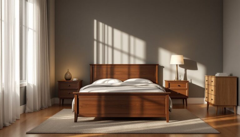
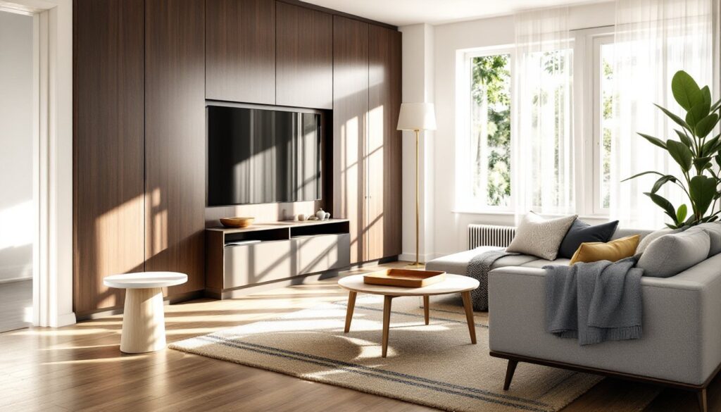
Walnut + White Oak: Deep chocolate-brown walnut paired with pale, almost gray-toned white oak creates high contrast without clashing. The cool undertones in white oak prevent warmth overload from walnut’s richness. This combo shows up frequently in contemporary interiors for its clean, modern feel.
Cherry + Maple: Cherry’s warm reddish-brown plays well with maple’s creamy blonde. Both have similar grain patterns, which creates visual continuity even as the tones differ. Cherry darkens with age, so this pairing becomes richer over time.
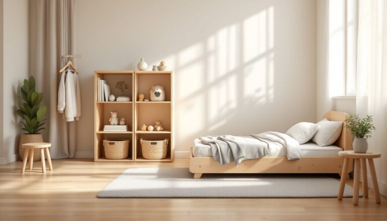
Espresso-Stained Pine + Natural Birch: When working with stained woods rather than natural species, espresso (a very dark, almost black-brown stain) contrasts beautifully with birch’s light, slightly pink-beige hue. This works especially well in farmhouse or transitional styles.
Mahogany + Ash: Mahogany’s deep reddish undertones find balance in ash’s pale gray-brown neutrality. The key here is keeping mahogany as the dominant tone, ash works best as an accent to avoid washing out mahogany’s richness.
Teak + Beech: Mid-century modern lovers appreciate this pairing. Teak’s golden-brown warmth complements beech’s lighter, pinker tone. Both woods have relatively straight grain, which maintains visual calm even though the tonal difference.
Avoid pairing woods with conflicting undertones, for example, orange-toned pine with cool gray-washed oak. The color temperature clash creates dissonance. Stick to warm-with-warm or cool-with-cool undertones, varying only the darkness level.
How to Tie Mixed Wood Furniture Together
Contrast works when something unifies the room beyond the wood itself. These techniques create cohesion without sacrificing variety.
Match the finish sheen: Even if tones differ, keeping finishes consistent, all matte, all satin, or all high-gloss, creates visual harmony. A glossy cherry table beside a matte walnut shelf feels disjointed. If pieces arrive with different sheens, consider applying polyurethane or tung oil at a uniform sheen level.
Repeat a wood tone in smaller doses: If the main coffee table is dark walnut, echo that tone in picture frame molding or a small decorative bowl. If side chairs are light oak, add an oak serving tray on the media console. Repetition signals intention.
Use rugs and textiles as bridges: A rug with both warm and cool tones can tie together disparate wood colors. For example, a jute rug with charcoal and cream stripes connects espresso and birch furniture by reflecting both ends of the spectrum. Throw pillows, curtains, and blankets do the same work.
Incorporate non-wood materials strategically: Metal, glass, or stone accents break up wood-heavy spaces and give the eye rest. A brushed brass floor lamp or marble-top side table between dark and light wood pieces creates breathing room. This technique appears often in curated design inspiration where material variety balances wood tone contrasts.
Align furniture style, not color: When wood tones vary, keep furniture style consistent. Mid-century modern pieces in mixed woods read cohesively because the tapered legs, clean lines, and minimalist forms share a design language. Mixing a rustic pine farmhouse table with a sleek walnut credenza rarely works, not because of the wood tones, but because the styles clash.
Common Mistakes to Avoid When Mixing Wood Tones
Ignoring undertones: Woods have warm (yellow, orange, red) or cool (gray, taupe) undertones. Mixing a warm honey oak with a cool gray-washed piece creates color temperature clash. Test undertones by placing a white sheet of paper next to the wood, the reflected color reveals whether it leans warm or cool.
Too many wood tones: Three is the functional maximum. More than that, and the room reads chaotic. Stick to one dominant, one secondary, and optionally one small accent tone.
Matching wood to flooring exactly: When furniture matches hardwood floors perfectly, pieces disappear visually. Aim for furniture that’s at least two shades lighter or darker than the floor. If floors are medium oak, go with either pale ash or deep walnut furniture.
Forgetting about wood grain: Busy, cathedral-grain oak competes with highly figured walnut. When mixing tones, balance bold grain patterns with straighter-grain woods. Pair quarter-sawn oak (straight, tight grain) with walnut burl (wild, swirling grain) rather than two heavily figured species.
Skipping a trial arrangement: Before committing, arrange furniture in the room and live with it for a few days. Natural and artificial light change how wood tones interact. A pairing that works in morning sunlight might feel off under evening lamplight.
Neglecting hardware and trim: Doorway trim, baseboards, and built-in shelving count as wood tones. If trim is stained dark, adding more dark furniture can overwhelm the space. Consider painting trim white or off-white to neutralize it, allowing furniture to stand out.
Buying everything at once: Curated rooms evolve. Start with one or two key pieces in different tones, then add gradually. This prevents overcommitting to a combination that doesn’t feel right in the actual space.